ロゴマークについて

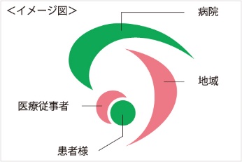
患者様と医療従事者が信頼でつながる地域に根ざした病院

病院の理念である「こころある医療を通して地域に貢献する」を実現するため、医療従事者が地域の患者様と信頼でつながり、包み込めるようなデザインにしました。
また、安心感をより提供できるように、丸みを帯びたオブジェクトで優しさを表現しました。
オブジェクトは、病院、地域、医療従事者、患者様の意味を持ちイメージ図のような構成になっています。さらに、たつの市の基幹病院として、「TATSUNO」の頭文字「T」と、「City」の頭文字「C」を表現しました。カラーは、当院のコンセプトカラーであるグリーンと心や愛情を想起するピンクを使用しました。


This website stores cookies on your computer. These cookies are used to provide a more personalized experience and to track your whereabouts around our website in compliance with the European General Data Protection Regulation. If you decide to to opt-out of any future tracking, a cookie will be setup in your browser to remember this choice for one year.

Accept or Deny